UX withMarta
Doposcuola24
Turning Educational Content into a Seamless Discovery Experience


Client: Doposcuola24


Year: 2025


Duration: 8 weeks


Team: Solo


Role: UX/UI
Doposcuola24's extensive library of educational resources had grown difficult to navigate, hindering parents and teachers in their search for relevant materials. Our redesign reimagined the website's structure—introducing a streamlined information architecture, modern taxonomy, and intuitive flows—to transform complexity into clarity and empower users to find what they need with ease. As a result, users experienced a reduction in time spent searching for resources and reported higher satisfaction with the website's usability.
Research & Insights
A quantitative research approach focused on understanding navigation pain points and user preferences to inform evidence-based design decisions for the DopoScuola24 resource library.


Research
Objectives
Clear goals established to understand navigation pain points and user preferences in the educational resource discovery process.
Identify current navigation pain points
Understand user search behaviors
Validate filtering preferences
Measure current satisfaction levels


Methodology & Participants
Quantitative approach using online questionnaire to gather statistically significant insights from parents and teachers.
68% Parents
Seeking homework support resources
32% Teachers
Looking for classroom materials


Information Architecture
Structured approach to organizing content hierarchy and improving findability through systematic design methodology.
• Content audit based on user mental models
• Card sorting to validate information grouping
• Taxonomy development aligned with standards
• Navigation optimized for browsing and search
Research Insights & User Needs
Users Pain Points
Navigation Confusion (78%)
Overwhelming menu structure made it difficult for users to find specific resources.
Search Abandonment (65%)
Users frequently abandoned searches due to irrelevant results and poor filtering options.
Mismatch in Resources (52%)
Difficulty finding resources matching specific learning objectives and subject requirements.
Users Preferences
Subject-Based Filtering (81%)
Strong preference for organizing content by subject as primary entry point for discovery.
Clear Learning Objectives (81%)
Users wanted to quickly understand what skill each lesson targets before downloading.
Class-Level Organization (72%)
Secondary filtering by class level valued
for narrowing down age-appropriate content.
Project Constraints
Despite working with a limited budget and minimal resources, this project maintained high UX standards by prioritizing evidence-based design decisions, lean research methodologies, and sustainable information architecture solutions that could be implemented cost-effectively while delivering maximum impact on user experience.
Transforming the Experience
Key design decisions that turned challenges into an intuitive and cohesive UI.
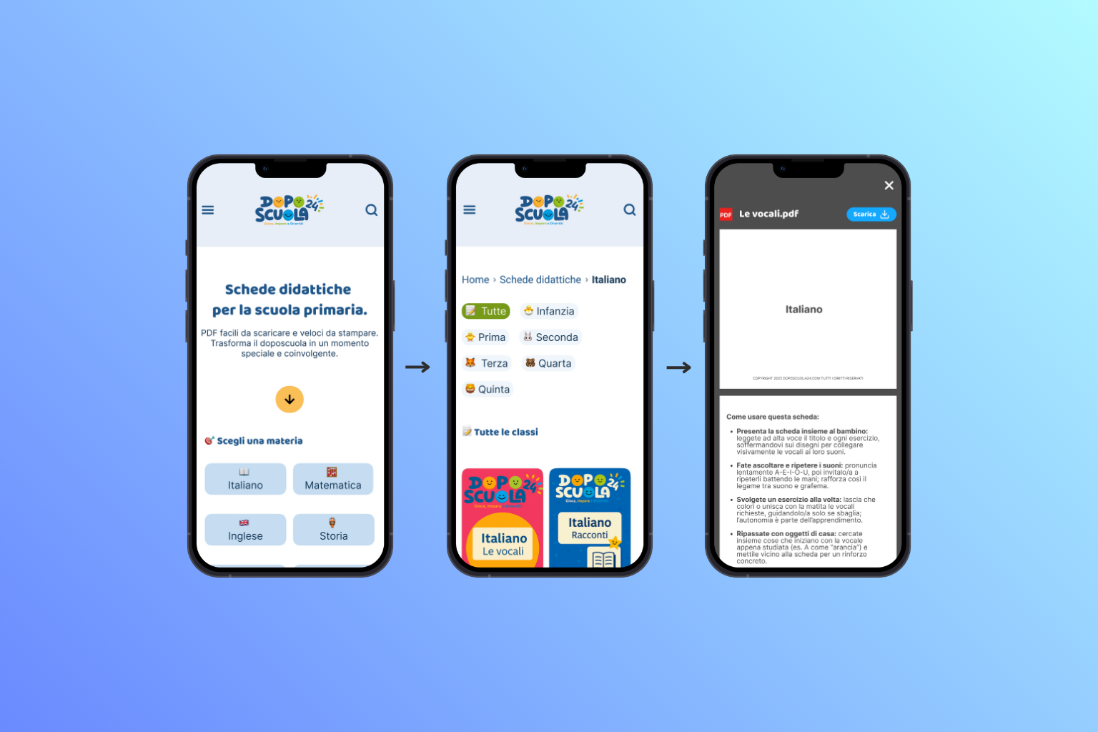
Reimagining Resource Discovery for Parents and Teachers

Research showed that users wanted to filter by both subject and topic, but topics change constantly and each subject could have hundreds of them—making topics unsustainable for navigation. For this reason, subjects became the main entry point, placed right below the hero section for instant access and within the hamburger menu. The new menu moves away from a generic list and instead gives users a clear, organized view of all available subjects, making it much easier to jump directly to the content they need. This update not only streamlines navigation but also ensures that access to resources is always straightforward, whether browsing from the homepage or the menu.

Rebuilding Navigation: Simple Layers for Effortless Discovery
Although preferences for filtering by class were mixed, class was selected as the secondary filter, allowing users to drill down in a way that remains coherent. The third layer highlights the objective of each worksheet, since parents and teachers indicated they want to quickly understand what skill or ability each lesson targets. Objectives are short, standard, and help keep navigation clear. Topics, themes, and special occasions are not visible filters because they are always evolving; instead, users can search for them anytime using the search bar, which is always available but never distracting. This layered approach keeps navigation simple for users and ensures the site remains sustainable as it grows—making it easy to find the right resource every time.

A Footer That Connects and Guides
Research highlighted that users rely on the footer for quick access to essential links and ways to stay connected. The new Doposcuola24 footer brings everything users need into clear view: a prominent newsletter signup encourages ongoing engagement, while social links and key site sections are neatly organized and easy to tap. Visual clarity and hierarchy make it simple to find what matters—whether it's subscribing for updates, connecting on social, or jumping to important pages. This refreshed footer isn't just tidier; it's designed to guide, connect, and support users at every scroll, making every visit feel complete and welcoming.

Outcomes & Takeaways
The solutions, results, and learnings that emerged from this project.


Challanges
- Organizing hundreds of dynamic topics and themes in a sustainable way
- Balancing detailed filtering with simple navigation for busy parents and teachers
- Creating an information architecture that scales as content grows
- Maintaining search efficiency while accommodating diverse user mental models
- Designing for both quick resource discovery and browsing scenarios


Solutions
- Three-layer navigation system: Subject → Class → Learning Objective
- Search functionality for dynamic content (topics, themes, occasions)
- Subject-based primary navigation with clear visual hierarchy
- Simplified menu structure with organized subject categorization
- Responsive design optimized for both mobile and desktop usage patterns
Optimised Resource Discovery Experience
We redesigned the entire resource browsing and discovery process to be more intuitive, efficient, and tailored to how parents and teachers naturally search for educational materials.
01
Subject Entry
Clear organization and enhanced search make finding the right resource quick and effortless—while improved descriptions help users choose with confidence.
02
Refined Filtering
Secondary filters by class level narrow results to age-appropriate materials, and learning objectives point to resources that meet specific goals.
03
Resource Discovery
Starting with a subject from the homepage or menu provides a clear, direct path to relevant content.
Impact Metrics
The redesigned navigation and information architecture significantly improved user experience and efficiency in finding relevant educational resources.
-68%
Reduction in Search Time
+85%
User Satisfaction Increase
4.6/5
Navigation Usability Rating
Design Insights & Learning
This project provided valuable insights into information architecture design for educational content and the balance between comprehensive filtering and simple navigation.
01
Sustainable Information Architecture
Dynamic content requires flexible organization - using stable categories (subjects) as primary navigation while enabling search for evolving content (topics, themes).
02
User Mental Models in Education
Parents and teachers naturally think in terms of subjects and learning objectives, making this the most intuitive entry point for resource discovery.
03
Progressive Disclosure for Complex Systems
Layered navigation (Subject → Class → Objective) provides depth while maintaining simplicity at each decision point.
04
Data-Driven Design Validation
Quantitative research with concrete metrics provides strong justification for design decisions and stakeholder buy-in.
Tools & Technologies
Figma
Excel
Google Forms
Useberry
Google Analytics
Elementor
Other Projects
Oceanea
UX with Marta

Home
About
Portfolio
Services
Blog
Get in touch!
Doposcuola24
Turning Educational Content into a Seamless Discovery Experience
Client: Doposcuola24
Year: 2025
Duration: 8 weeks
Team: Solo project
Role: UX/UI Designer
Doposcuola24's extensive library of educational resources had grown difficult to navigate, hindering parents and teachers in their search for relevant materials. Our redesign reimagined the website's structure—introducing a streamlined information architecture, modern taxonomy, and intuitive flows—to transform complexity into clarity and empower users to find what they need with ease. As a result, users experienced a reduction in time spent searching for resources and reported higher satisfaction with the website's usability.
Research & Insights
A quantitative research approach focused on understanding navigation pain points and user preferences to inform evidence-based design decisions for the DopoScuola24 resource library.
Research
Objectives
Clear goals established to understand navigation pain points and user preferences in the educational resource discovery process.
Identify current navigation pain points
Understand user search behaviors
Validate filtering preferences
Measure current satisfaction levels

Methodology & Participants
Quantitative approach using online questionnaire to gather statistically significant insights from parents and teachers.
68% Parents
Seeking homework support resources
32% Teachers
Looking for classroom materials
label
copy
Information Architecture
Structured approach to organizing content hierarchy and improving findability through systematic design methodology.
• Content audit based on user mental models
• Card sorting to validate information grouping
• Taxonomy development aligned with standards
• Navigation optimized for browsing and search
Research Insights & User Needs
Users Pain Points
Navigation Confusion (78%)
Overwhelming menu structure made it difficult
for users to find specific resources.
Search Abandonment (65%)
Users frequently abandoned searches due to
irrelevant results and poor filtering options.
Mismatch in Resources (52%)
Difficulty finding resources matching specific
learning objectives and subject requirements.
Users Preferences
Subject-Based Filtering (81%)
Strong preference for organizing content by subject
Clear Learning Objectives (81%)
Users wanted to quickly understand lesson’s skills before downloading.
Class-Level Organization (72%)
Secondary filtering by class level valued
for narrowing down age-appropriate content.
Project Constraints
Despite working with a limited budget and minimal resources, this project maintained high UX standards by prioritizing evidence-based design decisions, lean research methodologies, and sustainable information architecture solutions that could be implemented cost-effectively while delivering maximum impact on user experience.
Transforming the Experience
Key design decisions that turned challenges into an intuitive and cohesive UI.
Reimagining Resource Discovery for Parents and Teachers
Research showed that users wanted to filter by both subject and topic, but topics change constantly and each subject could have hundreds of them—making topics unsustainable for navigation. For this reason, subjects became the main entry point, placed right below the hero section for instant access and within the hamburger menu. The new menu moves away from a generic list and instead gives users a clear, organized view of all available subjects, making it much easier to jump directly to the content they need. This update not only streamlines navigation but also ensures that access to resources is always straightforward, whether browsing from the homepage or the menu.
Rebuilding Navigation:
Simple Layers for Effortless Discovery
Although preferences for filtering by class were mixed, class was selected as the secondary filter, allowing users to drill down in a way that remains coherent. The third layer highlights the objective of each worksheet, since parents and teachers indicated they want to quickly understand what skill or ability each lesson targets. Objectives are short, standard, and help keep navigation clear. Topics, themes, and special occasions are not visible filters because they are always evolving; instead, users can search for them anytime using the search bar, which is always available but never distracting. This layered approach keeps navigation simple for users and ensures the site remains sustainable as it grows—making it easy to find the right resource every time.
A Footer That Connects and Guides
Research highlighted that users rely on the footer for quick access to essential links and ways to stay connected. The new Doposcuola24 footer brings everything users need into clear view: a prominent newsletter signup encourages ongoing engagement, while social links and key site sections are neatly organized and easy to tap. Visual clarity and hierarchy make it simple to find what matters—whether it's subscribing for updates, connecting on social, or jumping to important pages. This refreshed footer isn't just tidier; it's designed to guide, connect, and support users at every scroll, making every visit feel complete and welcoming.
Outcomes & Takeaways
The solutions, results, and learnings that emerged from this project.
Challanges
- Organizing hundreds of dynamic topics and themes in a sustainable way
- Balancing detailed filtering with simple navigation for busy parents and teachers
- Creating an information architecture that scales as content grows
- Maintaining search efficiency while accommodating diverse user mental models
- Designing for both quick resource discovery and browsing scenarios
Solutions
- Three-layer navigation system: Subject → Class → Learning Objective
- Search functionality for dynamic content (topics, themes, occasions)
- Subject-based primary navigation with clear visual hierarchy
- Simplified menu structure with organized subject categorization
- Responsive design optimized for both mobile and desktop usage patterns
Optimised Resource Discovery Experience
We redesigned the entire resource browsing and discovery process to be more intuitive, efficient, and tailored to how parents and teachers naturally search for educational materials.
01
Subject Entry
Clear organization and enhanced search make finding the right resource quick and effortless—while improved descriptions help users choose with confidence.
02
Refined Filtering
Secondary filters by class level narrow results to age-appropriate materials, and learning objectives point to resources that meet specific goals.
03
Resource Discovery
Starting with a subject from the homepage or menu provides a clear, direct path to relevant content.
Impact Metrics
The redesigned navigation and information architecture significantly improved user experience and efficiency in finding relevant educational resources.
-68%
Reduction in Search Time
+85%
User Satisfaction Increase
4.6/5
Navigation Usability Rating
Design Insights & Learning
This project provided valuable insights into information architecture design for educational content and the balance between comprehensive filtering and simple navigation.
01
Sustainable Information Architecture
Dynamic content requires flexible organization - using stable categories (subjects) as primary navigation while enabling search for evolving content (topics, themes).
02
User Mental Models in Education
Parents and teachers naturally think in terms of subjects and learning objectives, making this the most intuitive entry point for resource discovery.
03
Progressive Disclosure for Complex Systems
Layered navigation (Subject → Class → Objective) provides depth while maintaining simplicity at each decision point.
04
Data-Driven Design Validation
Quantitative research with concrete metrics provides strong justification for design decisions and stakeholder buy-in.
Tools & Technologies
Figma
Excel
Google Forms
Useberry
Google Analytics
Elementor
Other Projects
Oceanea
Doposcuola24
Turning Educational Content into a Seamless Discovery Experience
Doposcuola24's extensive library of educational resources had grown difficult to navigate, hindering parents and teachers in their search for relevant materials. Our redesign reimagined the website's structure—introducing a streamlined information architecture, modern taxonomy, and intuitive flows—to transform complexity into clarity and empower users to find what they need with ease. As a result, users experienced a reduction in time spent searching for resources and reported higher satisfaction with the website's usability.
Client: Doposcuola24
Year: 2025
Duration: 8 weeks
Role: UX/UI Designer
Research & Insights
A quantitative research approach focused on understanding navigation pain points and user preferences to inform evidence-based design decisions for the DopoScuola24 resource library.
Research
Objectives
Clear goals established to understand navigation pain points and user preferences in the educational resource discovery process.
Identify current navigation pain points
Understand user search behaviors
Validate filtering preferences
Measure current satisfaction levels
Methodology & Participants
Quantitative approach using online questionnaire to gather statistically significant insights from parents and teachers.
68% Parents
Seeking homework support resources
32% Teachers
Looking for classroom materials
Information Architecture
Structured approach to organizing content hierarchy and improving findability through systematic design methodology.
• Content audit based on user mental models
• Card sorting to validate information grouping
• Taxonomy development aligned with standards
• Navigation optimized for browsing and search
Research Insights & User Needs
Users Pain Points
Navigation Confusion (78%)
Overwhelming menu structure made it difficult
for users to find specific resources.
Search Abandonment (65%)
Users frequently abandoned searches due to
irrelevant results and poor filtering options.
Mismatch in Resources (52%)
Difficulty finding resources matching specific
learning objectives and subject requirements.
Users Preferences
Subject-Based Filtering (81%)
Strong preference for organizing content by subject
as primary entry point for discovery.
Clear Learning Objectives (81%)
Users wanted to quickly understand what skill
each lesson targets before downloading.
Class-Level Organization (72%)
Secondary filtering by class level valued
for narrowing down age-appropriate content.
Project Constraints
Despite working with a limited budget and minimal resources, this project maintained high UX standards by prioritizing evidence-based design decisions, lean research methodologies, and sustainable information architecture solutions that could be implemented cost-effectively while delivering maximum impact on user experience.
Transforming the Experience
Key design decisions that turned challenges into an intuitive and cohesive UI.
Reimagining Resource Discovery for Parents and Teachers
Research showed that users wanted to filter by both subject and topic, but topics change constantly and each subject could have hundreds of them—making topics unsustainable for navigation. For this reason, subjects became the main entry point, placed right below the hero section for instant access and within the hamburger menu. The new menu moves away from a generic list and instead gives users a clear, organized view of all available subjects, making it much easier to jump directly to the content they need. This update not only streamlines navigation but also ensures that access to resources is always straightforward, whether browsing from the homepage or the menu.
Rebuilding Navigation: Simple Layers for Effortless Discovery
Although preferences for filtering by class were mixed, class was selected as the secondary filter, allowing users to drill down in a way that remains coherent. The third layer highlights the objective of each worksheet, since parents and teachers indicated they want to quickly understand what skill or ability each lesson targets. Objectives are short, standard, and help keep navigation clear. Topics, themes, and special occasions are not visible filters because they are always evolving; instead, users can search for them anytime using the search bar, which is always available but never distracting. This layered approach keeps navigation simple for users and ensures the site remains sustainable as it grows—making it easy to find the right resource every time.
A Footer That Connects and Guides
Research highlighted that users rely on the footer for quick access to essential links and ways to stay connected. The new Doposcuola24 footer brings everything users need into clear view: a prominent newsletter signup encourages ongoing engagement, while social links and key site sections are neatly organized and easy to tap. Visual clarity and hierarchy make it simple to find what matters—whether it's subscribing for updates, connecting on social, or jumping to important pages. This refreshed footer isn't just tidier; it's designed to guide, connect, and support users at every scroll, making every visit feel complete and welcoming.
Outcomes & Takeaways
The solutions, results, and learnings that emerged from this project.
Challanges
- Organizing hundreds of dynamic topics and themes in a sustainable way
- Balancing detailed filtering with simple navigation for busy parents and teachers
- Creating an information architecture that scales as content grows
- Maintaining search efficiency while accommodating diverse user mental models
- Designing for both quick resource discovery and browsing scenarios
Solutions
- Three-layer navigation system: Subject → Class → Learning Objective
- Search functionality for dynamic content (topics, themes, occasions)
- Subject-based primary navigation with clear visual hierarchy
- Simplified menu structure with organized subject categorization
- Responsive design optimized for both mobile and desktop usage patterns
Optimised Resource Discovery Experience
We redesigned the entire resource browsing and discovery process to be more intuitive, efficient, and tailored to how parents and teachers naturally search for educational materials.
01
Subject Entry
Clear organization and enhanced search make finding the right resource quick and effortless—while improved descriptions help users choose with confidence.
02
Refined Filtering
Secondary filters by class level narrow results to age-appropriate materials, and learning objectives point to resources that meet specific goals.
03
Resource Discovery
Starting with a subject from the homepage or menu provides a clear, direct path to relevant content.
Impact Metrics
The redesigned navigation and information architecture significantly improved user experience and efficiency in finding relevant educational resources.
-68%
Reduction in Search Time
+85%
User Satisfaction Increase
4.6/5
Navigation Usability Rating
Design Insights & Learning
This project provided valuable insights into information architecture design for educational content and the balance between comprehensive filtering and simple navigation.
01
Sustainable Information Architecture
Dynamic content requires flexible organization - using stable categories (subjects) as primary navigation while enabling search for evolving content (topics, themes).
02
User Mental Models in Education
Parents and teachers naturally think in terms of subjects and learning objectives, making this the most intuitive entry point for resource discovery.
03
Progressive Disclosure for Complex Systems
Layered navigation (Subject → Class → Objective) provides depth while maintaining simplicity at each decision point.
04
Data-Driven Design Validation
Quantitative research with concrete metrics provides strong justification for design decisions and stakeholder buy-in.
Tools & Technologies
Figma
Excel
Google Forms
Useberry
Google Analytics
Elementor
Other Projects
Oceanea