UX with Marta


Home
About
Portfolio
Services
Blog
Get in touch!
Oceanea
Turning Educational Content into a Seamless Discovery Experience
Oceanea is a purpose-built platform to help environmental educators teach for impact, not just output. Developed from scratch in response to a focused design brief, Oceanea’s creation was guided by extensive user research. Educators expressed frustration with fragmented tools, repetitive manual work, and limited insight into student progress. The design process centered on addressing these pain points, with every decision grounded in direct user feedback and iterative testing. The result is a platform that streamlines content creation, fosters engagement, and aligns every feature with real-world sustainability goals.


Educational


Year: 2025


Duration: 16 weeks


Team: Solo Project


Role: UX/UI Designer
Research & Insights
Qualitative research with environmental-education professionals to understand real needs, reduce friction, and guide a focused MVP.


Research
Objectives
Clear goals established to understand educators pain points and user preferences in the environmental online education.
- Understand how educators create, manage, and track courses;
- Identify pain points across tools; define the metrics that matter;
- Shape an information architecture and workflow that feel clear, efficient, and inclusive.


Methodology & Participants
Qualitative approach using 10 semi-structured interviews with expert practitioners; insights shaped MVP scope and priorities.
- 4 Content Creators
- 3 Corporate Trainees
- 3 Academics


User
Personas
- Content Creator – Needs fast course editing, centralized progress tracking, and minimal admin overhead.
- Corporate Trainee – Values clear learning progress, simple enrollment processes, and mobile accessibility.
- Academic – Requires structured curricula, robust assessment tools, and comprehensive reporting capabilities.
Research Insights & User Needs
Users Pain Points
Fragmented tools
Progress, engagement, and revenue live in separate systems—slow decisions, missed signals.
Heavy admin load
Updating, grading, and messaging are manual and repetitive, reducing time for teaching.
Limited visibility
Hard to spot disengaged learners early or see which courses need attention.
Users Preferences
One dashboard, clear signals
A single place for performance, engagement, grading tasks, messages, and revenue.
Streamlined course library
Drag-and-drop editing, built-in tools, and automation to reduce repetitive work.
Simple, accessible UI
Predictable patterns and readable typography that support quick decisions.
Project Constraints
Time & recruitment limits. With limited time and resources, we applied proven best practices and delivered an MVP—centralized metrics via the dashboard and simplified course management—so educators gained immediate value and we could iterate with data.
From Insights to Experience
Turning insights into a platform that works for educators, learners, and long-term goals.
Mission Control: Insights at a Glance
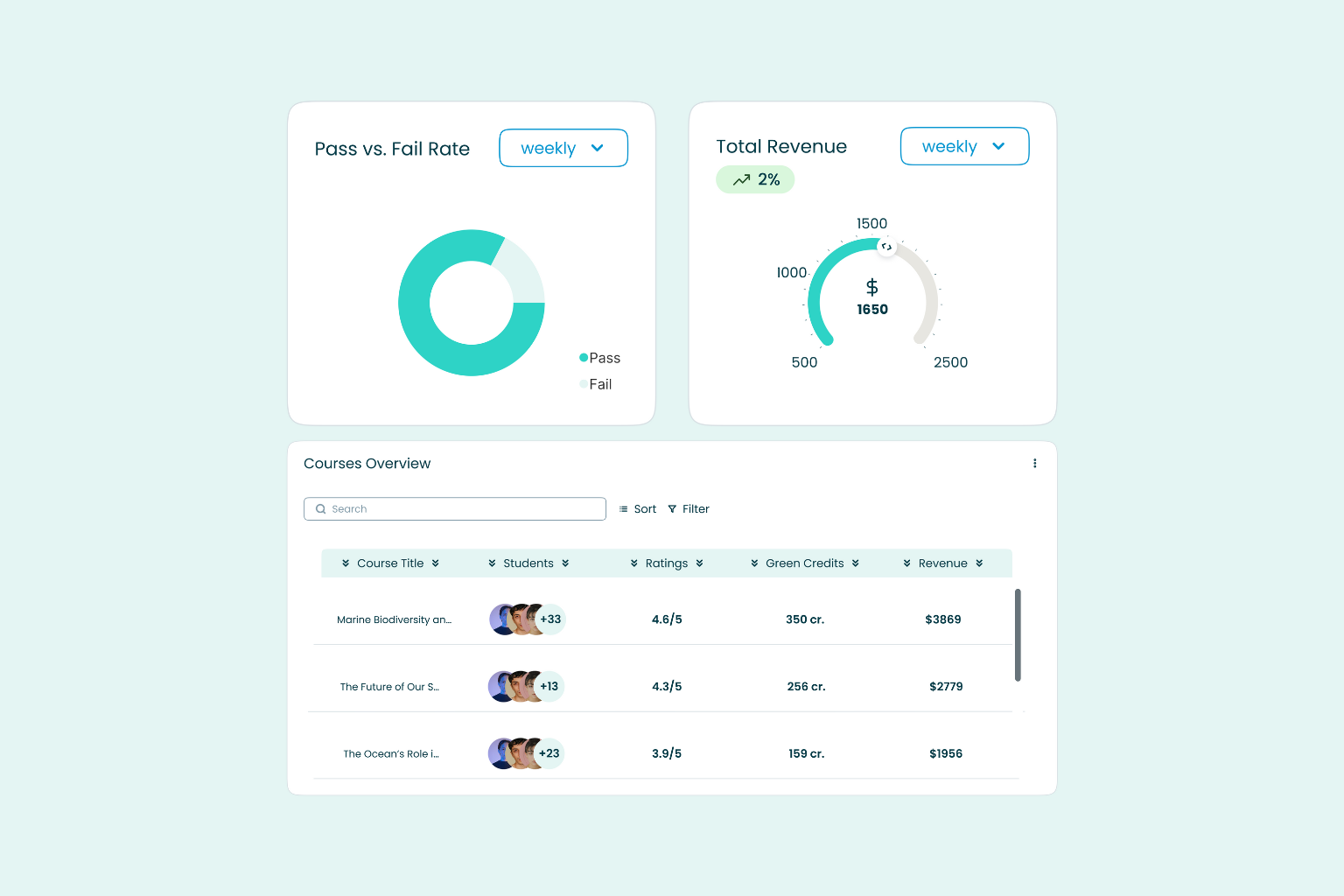
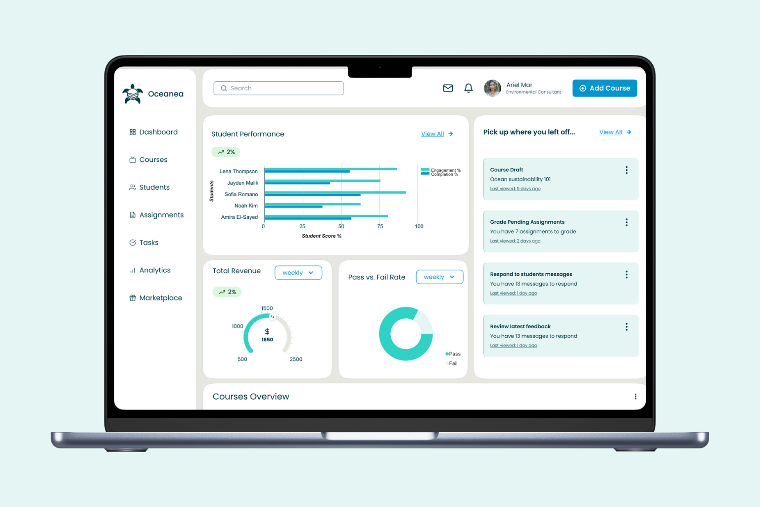
Research revealed that educators struggled to track student progress, engagement, and revenue across multiple tools, leading to inefficiency and missed opportunities for timely intervention. Oceanea’s dashboard directly addresses these issues by centralising key metrics—student performance, engagement rates, assignments to grade, messages to respond to, and revenue—into a single, visually clear interface. This consolidation allows educators to monitor progress, identify disengaged learners, and respond quickly to student needs, all from one place. Usability testing confirmed the dashboard’s effectiveness: 75% of educators completed core tasks with ease, and most rated the experience as very easy.
Effortless Content Creation and Management
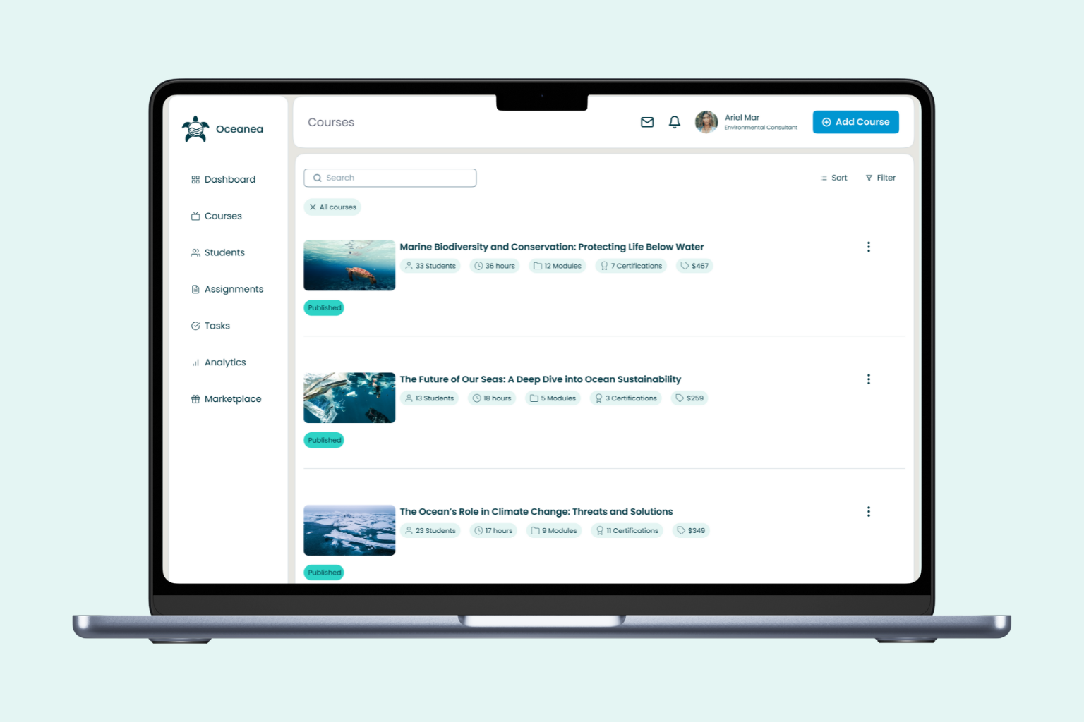
User interviews and surveys highlighted the need for a streamlined, intuitive way to create, update, and organize courses. Oceanea’s course library was designed as a dedicated space for managing both published and draft courses. Features like drag-and-drop editing, built-in content tools, and automated grading were prioritized based on educators’ desire for reduced manual workload and simpler workflows. The library also enables tracking of student enrollment, completion rates, and revenue per course, giving educators a comprehensive view of their teaching impact.
Purposeful, Sustainable, and Clear
Oceanea’s brand identity was crafted to reflect clarity, inclusion, and long-term ecological impact. The marine-inspired color palette blends blues and turquoise to evoke calm and responsibility, deliberately avoiding green clichés. The turtle logo symbolizes wisdom, resilience, and steady progress—qualities identified as aspirational by educators during research. The Poppins typeface was chosen for its clean structure and accessibility, supporting a seamless learning experience. Every UI element follows a consistent, scalable logic, reducing friction for both users and developers.
Outcomes & Takeaways
The solutions, results, and learnings that emerged from this project.


Challanges
- One platform, many needs Designing for three distinct personas (content creators, corporate trainees, academics) required balancing flexibility with simplicity.
- Clunky content workflows Educators juggled multiple tools for course creation, grading, and communication—leading to inefficiencies and lost time.
- Limited visibility on impact Tracking student progress, engagement, and revenue was fragmented, making it hard to act quickly and improve outcomes.


Solutions
- Focused MVP with shared value Despite different user types, we found common pain points and built an MVP that addressed all their core needs.
- Unified dashboard experience A centralized hub shows key metrics at a glance—student performance, engagement, messages, grading, and revenue.
- Streamlined course creation Drag-and-drop tools, auto-grading, and clear course tracking simplified daily workflows and reduced manual effort.
One Experience, Multiple Needs
Designing a scalable MVP that meets diverse user goals without adding complexity.
01
Insight at a glance
The dashboard puts everything educators need in one place—student performance, engagement rates, pending assignments, unread messages, and revenue. Centralization makes it faster to spot disengaged learners and respond before issues escalate.
02
Effortless Content Creation & Management
The course library allows drag-and-drop editing, built-in content tools, and automated grading—cutting down on manual work. Educators can manage published and draft courses, track enrollment, completion rates, and revenue per course from one space.
03
Shared Needs Across Personas
Despite different roles, all three personas—content creators, trainees, and academics—faced overlapping challenges. Focusing on those shared pain points allowed us to shape an MVP that met everyone’s needs without overextending the scope.
Design Insights & Learning
This project provided valuable insights into information architecture design for educational content and the balance between comprehensive filtering and simple navigation.
01
Start with shared pain points
When users are diverse, grounding decisions in overlapping needs is the fastest path to impact.
02
Small MVP, strong signal
Focusing on an MVP helped us stay lean while still delivering high value across user types.
03
Consistency makes complexity feel simple
A clean structure, visual clarity, and scalable components helped create a seamless experience—even in a feature-rich platform.
04
Test early to stay grounded
User interviews and usability testing shaped the design from day one, keeping assumptions in check and solutions aligned with real workflows.
Tools & Technologies
Figma
Excel
Google Forms
Useberry
Other Projects
UX with Marta
Home
About
Portfolio
Services
Blog
Get in touch!
Oceanea
Turning Educational Content into a Seamless Discovery Experience
Oceanea is a purpose-built platform to help environmental educators teach for impact, not just output. Developed from scratch in response to a focused design brief, Oceanea’s creation was guided by extensive user research. Educators expressed frustration with fragmented tools, repetitive manual work, and limited insight into student progress. The design process centered on addressing these pain points, with every decision grounded in direct user feedback and iterative testing. The result is a platform that streamlines content creation, fosters engagement, and aligns every feature with real-world sustainability goals.
Educational
Year: 2025
Duration: 16 weeks
Team: Solo Project
Role: UX/UI Designer
Research & Insights
Qualitative research with environmental-education professionals to understand real needs, reduce friction, and guide a focused MVP.
Research
Objectives
Clear goals established to understand educators pain points and user preferences in the environmental online education.
- Understand how educators create, manage, and track courses;
- Identify pain points across tools; define the metrics that matter;
- Shape an information architecture and workflow that feel clear, efficient, and inclusive.
Methodology & Participants
Qualitative approach using 10 semi-structured interviews with expert practitioners; insights shaped MVP scope and priorities.
- 4 Content Creators
- 3 Corporate Trainees
- 3 Academics
User
Personas
- Content Creator – Needs fast course editing, centralized progress tracking, and minimal admin overhead.
- Corporate Trainee – Values clear learning progress, simple enrollment processes, and mobile accessibility.
- Academic – Requires structured curricula, robust assessment tools, and comprehensive reporting capabilities.
Research Insights & User Needs
Users Pain Points
Fragmented tools
Progress, engagement, and revenue live in separate systems—slow decisions, missed signals.
Heavy admin load
Updating, grading, and messaging are manual and repetitive, reducing time for teaching.
Limited visibility
Hard to spot disengaged learners early or see which courses need attention.
Users Preferences
One dashboard, clear signals
A single place for performance, engagement, grading tasks, messages, and revenue.
Streamlined course library
Drag-and-drop editing, built-in tools, and automation to reduce repetitive work.
Simple, accessible UI
Predictable patterns and readable typography that support quick decisions.
Project Constraints
Time & recruitment limits. With limited time and resources, we applied proven best practices and delivered an MVP—centralized metrics via the dashboard and simplified course management—so educators gained immediate value and we could iterate with data.
From Insights to Experience
Turning insights into a platform that works for educators, learners, and long-term goals.
Mission Control: Insights at a Glance
Research revealed that educators struggled to track student progress, engagement, and revenue across multiple tools, leading to inefficiency and missed opportunities for timely intervention. Oceanea’s dashboard directly addresses these issues by centralising key metrics—student performance, engagement rates, assignments to grade, messages to respond to, and revenue—into a single, visually clear interface. This consolidation allows educators to monitor progress, identify disengaged learners, and respond quickly to student needs, all from one place. Usability testing confirmed the dashboard’s effectiveness: 75% of educators completed core tasks with ease, and most rated the experience as very easy.
Effortless Content Creation and Management
User interviews and surveys highlighted the need for a streamlined, intuitive way to create, update, and organize courses. Oceanea’s course library was designed as a dedicated space for managing both published and draft courses. Features like drag-and-drop editing, built-in content tools, and automated grading were prioritized based on educators’ desire for reduced manual workload and simpler workflows. The library also enables tracking of student enrollment, completion rates, and revenue per course, giving educators a comprehensive view of their teaching impact.
Purposeful, Sustainable, and Clear
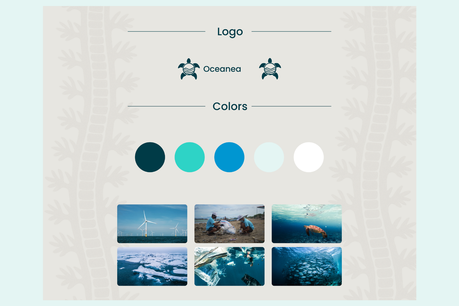
Oceanea’s brand identity was crafted to reflect clarity, inclusion, and long-term ecological impact. The marine-inspired color palette blends blues and turquoise to evoke calm and responsibility, deliberately avoiding green clichés. The turtle logo symbolizes wisdom, resilience, and steady progress—qualities identified as aspirational by educators during research. The Poppins typeface was chosen for its clean structure and accessibility, supporting a seamless learning experience. Every UI element follows a consistent, scalable logic, reducing friction for both users and developers.
Outcomes & Takeaways
The solutions, results, and learnings that emerged from this project.
Challanges
- One platform, many needs Designing for three distinct personas (content creators, corporate trainees, academics) required balancing flexibility with simplicity.
- Clunky content workflows Educators juggled multiple tools for course creation, grading, and communication—leading to inefficiencies and lost time.
- Limited visibility on impact Tracking student progress, engagement, and revenue was fragmented, making it hard to act quickly and improve outcomes.
Solutions
- Focused MVP with shared value Despite different user types, we found common pain points and built an MVP that addressed all their core needs.
- Unified dashboard experience A centralized hub shows key metrics at a glance—student performance, engagement, messages, grading, and revenue.
- Streamlined course creation Drag-and-drop tools, auto-grading, and clear course tracking simplified daily workflows and reduced manual effort.
One Experience, Multiple Needs
Designing a scalable MVP that meets diverse user goals without adding complexity.
01
Insight at a glance
The dashboard puts everything educators need in one place—student performance, engagement rates, pending assignments, unread messages, and revenue. Centralization makes it faster to spot disengaged learners and respond before issues escalate.
02
Effortless Content Creation & Management
The course library allows drag-and-drop editing, built-in content tools, and automated grading—cutting down on manual work. Educators can manage published and draft courses, track enrollment, completion rates, and revenue per course from one space.
03
Shared Needs Across Personas
Despite different roles, all three personas—content creators, trainees, and academics—faced overlapping challenges. Focusing on those shared pain points allowed us to shape an MVP that met everyone’s needs without overextending the scope.
Design Insights & Learning
This project provided valuable insights into information architecture design for educational content and the balance between comprehensive filtering and simple navigation.
01
Start with shared pain points
When users are diverse, grounding decisions in overlapping needs is the fastest path to impact.
02
Small MVP, strong signal
Focusing on an MVP helped us stay lean while still delivering high value across user types.
03
Consistency makes complexity feel simple
A clean structure, visual clarity, and scalable components helped create a seamless experience—even in a feature-rich platform.
04
Test early to stay grounded
User interviews and usability testing shaped the design from day one, keeping assumptions in check and solutions aligned with real workflows.
Tools & Technologies
Figma
Excel
Google Forms
Useberry
Other Projects
Oceanea
Turning Educational Content into a Seamless Discovery Experience
Oceanea is a purpose-built platform to help environmental educators teach for impact, not just output. Developed from scratch in response to a focused design brief, Oceanea’s creation was guided by extensive user research. Educators expressed frustration with fragmented tools, repetitive manual work, and limited insight into student progress. The design process centered on addressing these pain points, with every decision grounded in direct user feedback and iterative testing. The result is a platform that streamlines content creation, fosters engagement, and aligns every feature with real-world sustainability goals.
Educational
Year: 2025
Duration: 16 weeks
Team: Solo Project
Role: UX/UI Designer
Research & Insights
Qualitative research with environmental-education professionals to understand real needs, reduce friction, and guide a focused MVP.
Research
Objectives
Clear goals established to understand educators pain points and user preferences in the environmental online education.
- Understand how educators create, manage, and track courses;
- Identify pain points across tools; define the metrics that matter;
- Shape an information architecture and workflow that feel clear, efficient, and inclusive.
Methodology & Participants
Qualitative approach using 10 semi-structured interviews with expert practitioners; insights shaped MVP scope and priorities.
- 4 Content Creators
- 3 Corporate Trainees
- 3 Academics
User
Personas
- Content Creator – Needs fast course editing, centralized progress tracking, and minimal admin overhead.
- Corporate Trainee – Values clear learning progress, simple enrollment processes, and mobile accessibility.
- Academic – Requires structured curricula, robust assessment tools, and comprehensive reporting capabilities.
Research Insights & User Needs
Users Pain Points
Fragmented tools
Progress, engagement, and revenue live in separate systems—slow decisions, missed signals.
Heavy admin load
Updating, grading, and messaging are manual and repetitive, reducing time for teaching.
Limited visibility
Hard to spot disengaged learners early or see which courses need attention.
Users Preferences
One dashboard, clear signals
A single place for performance, engagement, grading tasks, messages, and revenue.
Streamlined course library
Drag-and-drop editing, built-in tools, and automation to reduce repetitive work.
Simple, accessible UI
Predictable patterns and readable typography that support quick decisions.
Project Constraints
Time & recruitment limits. With limited time and resources, we applied proven best practices and delivered an MVP—centralized metrics via the dashboard and simplified course management—so educators gained immediate value and we could iterate with data.
From Insights to Experience
Turning insights into a platform that works for educators, learners, and long-term goals.
Mission Control: Insights at a Glance
Research revealed that educators struggled to track student progress, engagement, and revenue across multiple tools, leading to inefficiency and missed opportunities for timely intervention. Oceanea’s dashboard directly addresses these issues by centralising key metrics—student performance, engagement rates, assignments to grade, messages to respond to, and revenue—into a single, visually clear interface. This consolidation allows educators to monitor progress, identify disengaged learners, and respond quickly to student needs, all from one place. Usability testing confirmed the dashboard’s effectiveness: 75% of educators completed core tasks with ease, and most rated the experience as very easy.
Effortless Content Creation and Management
User interviews and surveys highlighted the need for a streamlined, intuitive way to create, update, and organize courses. Oceanea’s course library was designed as a dedicated space for managing both published and draft courses. Features like drag-and-drop editing, built-in content tools, and automated grading were prioritized based on educators’ desire for reduced manual workload and simpler workflows. The library also enables tracking of student enrollment, completion rates, and revenue per course, giving educators a comprehensive view of their teaching impact.
Purposeful, Sustainable, and Clear
Oceanea’s brand identity was crafted to reflect clarity, inclusion, and long-term ecological impact. The marine-inspired color palette blends blues and turquoise to evoke calm and responsibility, deliberately avoiding green clichés. The turtle logo symbolizes wisdom, resilience, and steady progress—qualities identified as aspirational by educators during research. The Poppins typeface was chosen for its clean structure and accessibility, supporting a seamless learning experience. Every UI element follows a consistent, scalable logic, reducing friction for both users and developers.
Outcomes & Takeaways
The solutions, results, and learnings that emerged from this project.
Challanges
- One platform, many needs Designing for three distinct personas (content creators, corporate trainees, academics) required balancing flexibility with simplicity.
- Clunky content workflows Educators juggled multiple tools for course creation, grading, and communication—leading to inefficiencies and lost time.
- Limited visibility on impact Tracking student progress, engagement, and revenue was fragmented, making it hard to act quickly and improve outcomes.
Solutions
- Focused MVP with shared value Despite different user types, we found common pain points and built an MVP that addressed all their core needs.
- Unified dashboard experience A centralized hub shows key metrics at a glance—student performance, engagement, messages, grading, and revenue.
- Streamlined course creation Drag-and-drop tools, auto-grading, and clear course tracking simplified daily workflows and reduced manual effort.
One Experience, Multiple Needs
Designing a scalable MVP that meets diverse user goals without adding complexity.
01
Insight at a glance
The dashboard puts everything educators need in one place—student performance, engagement rates, pending assignments, unread messages, and revenue. Centralization makes it faster to spot disengaged learners and respond before issues escalate.
02
Effortless Content Creation & Management
The course library allows drag-and-drop editing, built-in content tools, and automated grading—cutting down on manual work. Educators can manage published and draft courses, track enrollment, completion rates, and revenue per course from one space.
03
Shared Needs Across Personas
Despite different roles, all three personas—content creators, trainees, and academics—faced overlapping challenges. Focusing on those shared pain points allowed us to shape an MVP that met everyone’s needs without overextending the scope.
Design Insights & Learning
This project provided valuable insights into information architecture design for educational content and the balance between comprehensive filtering and simple navigation.
01
Start with shared pain points
When users are diverse, grounding decisions in overlapping needs is the fastest path to impact.
02
Small MVP, strong signal
Focusing on an MVP helped us stay lean while still delivering high value across user types.
03
Consistency makes complexity feel simple
A clean structure, visual clarity, and scalable components helped create a seamless experience—even in a feature-rich platform.
04
Test early to stay grounded
User interviews and usability testing shaped the design from day one, keeping assumptions in check and solutions aligned with real workflows.
Tools & Technologies
Figma
Excel
Google Forms
Useberry
Other Projects